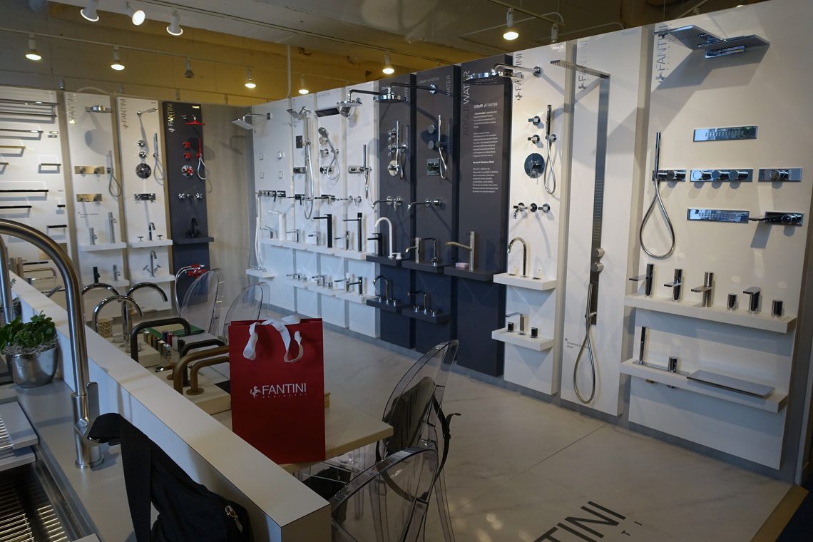
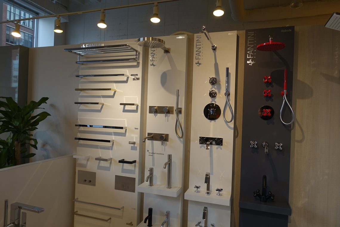
we are visiting italian bathroom fixtures specialist fantini in their new chicago showroom in the luxehome design resource center in chicago’s merchandise mart and speaking to riccardo conti, managing director / fantini north america. one’s first impression when looking at the products is striking sophistication and a leanness in form.
[designapplause] riccardo, welcome to chicago. please tell us what’s unique and special about fantini.
[riccardo conti] first of all this year is special as we celebrate 70 years. i think over the last few decades fantini has been particularly successful because of consistency. for example, every time we introduce a new collection it’s always a collaboration with a designer, and though each designer brings their own personal vision to their solutions, everything is very much aligned with a style that tells you it’s a fantini product.
and that’s always been the case but recent introductions the company has become very aggressive to a change in mindset. we have entered a new phase that while preserving a fantini style of simplicity and elegance, we’ve have added a more transitional look.
[da] looking over your presentation in this showroom you are an exception to the rule. it’s very rare for a showroom to successfully mix and match iconic simplicity with iconic traditional. the two esthetics usually are served up as diametrically opposed —— and people normally like one or the other. fantini has managed to maintain simplicity while adding classic sumptuousness.
[rc] yes, i certainly agree and thank you. the new vision goes together well with what is existing. our designs are never too loud, more quiet but very elegant with a good sense of proportion.
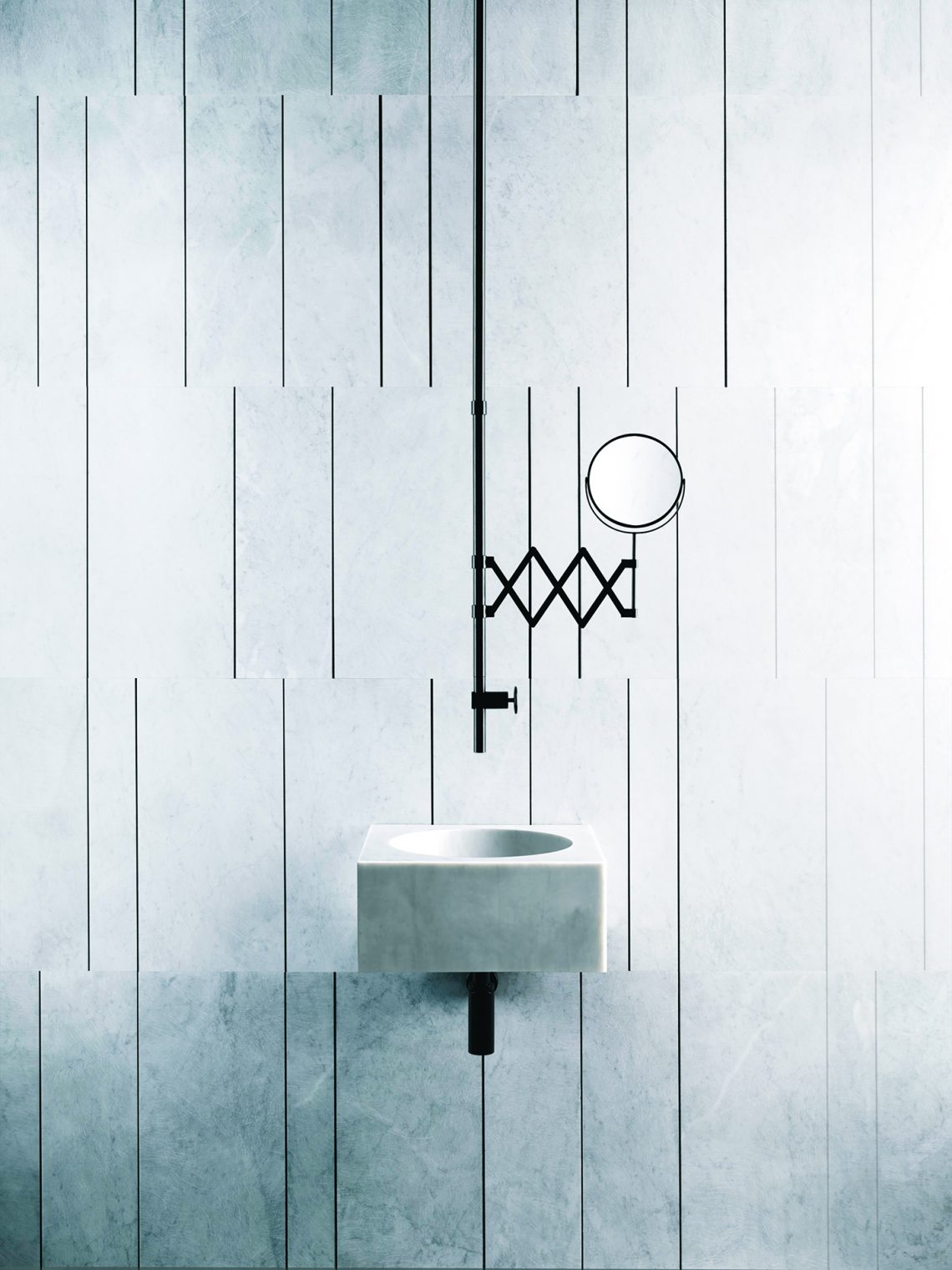
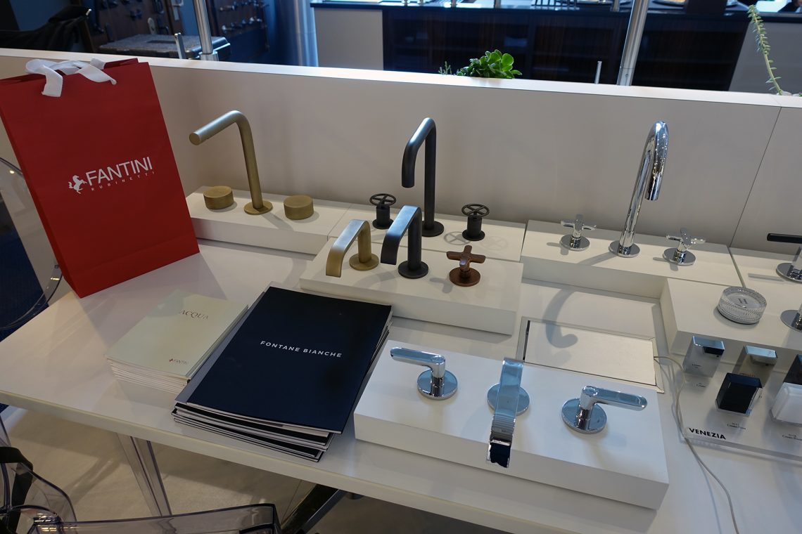
a good example is our fontane bianche collection designed by italian architect and interior stylist elisa ossino, a fusion of stone and water. in addition i’d like to say the collaboration with salvatori for the fontane bianche collection is not new to fantini because we have collaborated with others before, especially boffi which is ongoing. and coincidently, salvatori is also celebrating 70 years.
above/below> fontane bianche
the materials in this collection is more industrial with a sort of delicate touch. industrial elements are rough and unfinished surfaces. the idea behind the collaboration with salvatori was not to just introduce a line of faucets, but also include sinks and accessories that tie into one concept. maybe some clients would prefer just the faucets or just the sinks.
and this idea is precisely special and unique because today companies try to be include too many iterations together and lose some focus on being a specialist. we do have kitchen products but maybe we are not yet very strong. in fontane bianche, fantini remains a bathroom specialist.
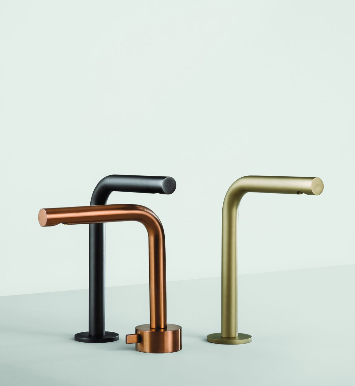
another new introduction is a collaboration with belgium architect / designer vincent van duysen, who is also the creative director for moltini, to create icona which offers two distinct concepts, icona classic and icona deco which communicates two sentiments, one of timelessness and one of memory.
above> icona classic / below> icona deco
[da] a noticeable detail is a distinctive metallic-like matte finish. how did the matte concept appear?
[rc] the finish is not new to us, it’s pvd (physical vapor deposition) treatment seen typically on jewelry, aerospace and biomedical applications and permits an unlimited range of color tones. pvd is more durable than chrome and aligns well within a bathroom environment. the new color palette comes in three options, matte gun metal, brushed copper and matte british gold. the finish permits an aged look but in fact it doesn’t age like real metal that tarnishes.
interestingly the use of color go way back to 70s and back then there were many colors. in recent years, black and white started trending although the trend never really took off. in addition to black and white, we added numerous other colors (all on custom request based on the “ral” range of colors) and it’s been quite successful, applied to the balocchi collection first and then extended to the whole range.
[da] what else is new?
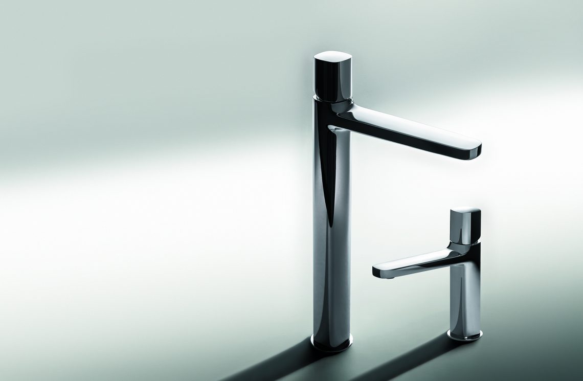
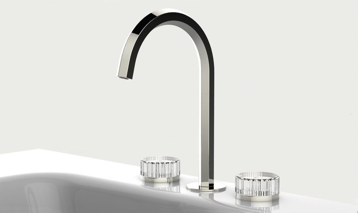
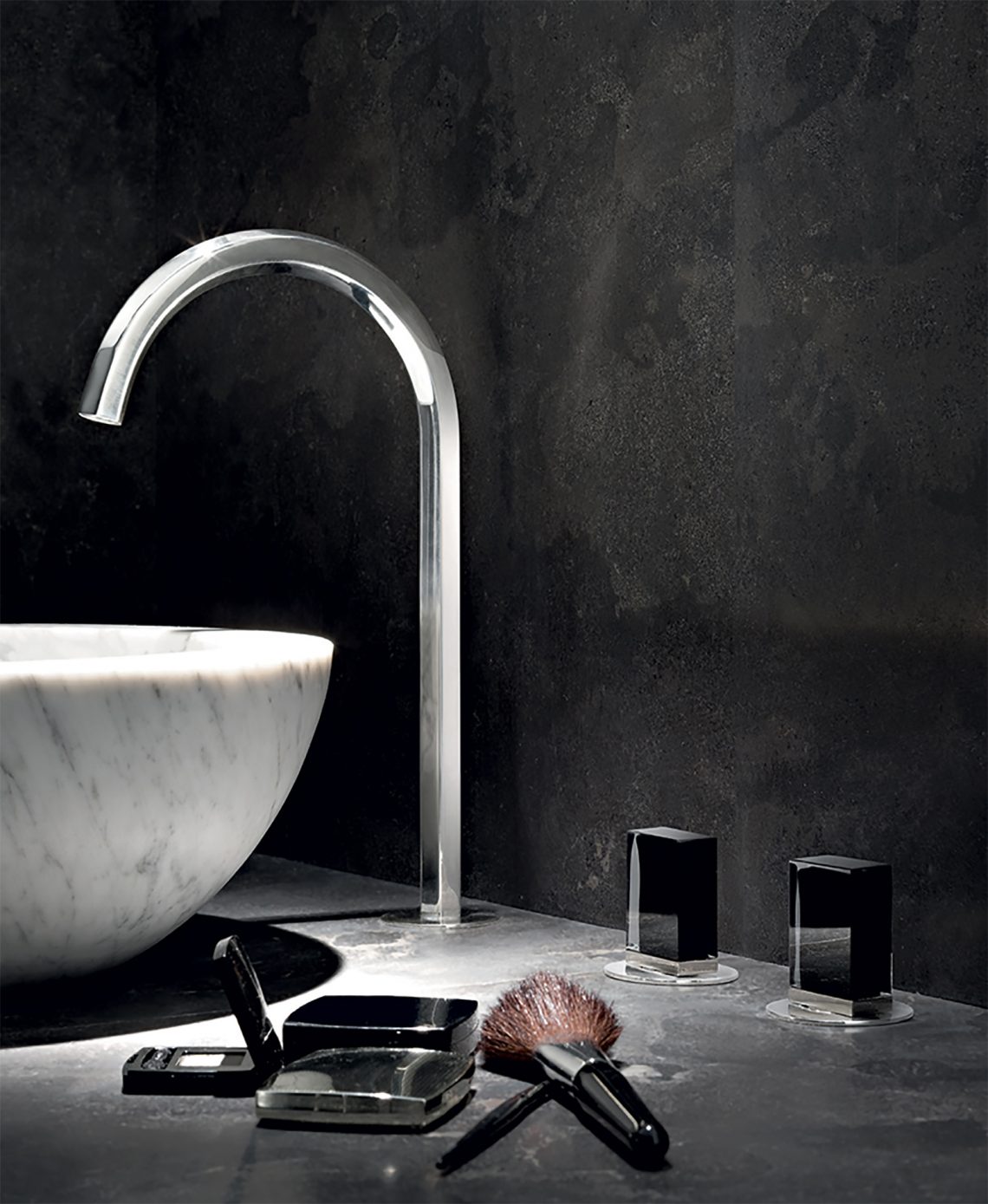
[rc] two new looks for us is lamé and venezia by italian designer matteo thun and spanish designer antonio rodriguez. lamé is an interesting shape and interesting to the touch, a square shape with rounded edges. it comes with a polished chrome finish with a unique and a choice of a contrasting matte black or white handle. a surprisingly well received new look are beautiful round crystal handles found in venezia which communicates style, tradition, elegance and refined luxury. venezia also has another classic lever handle in black or chrome plated metal.
above> lamé / below> venezia
[da] this finish looks like stainless steel.
[rc] for many years we’ve done the brushed nickel finish. but we’ve discontinued that finish and we now use stainless steel 316 as it is marine grade and highly resistant to corrosion. it’s used a lot in outdoor applications, it’s recyclable and really eco-friendly because when you do brass/nickel finish there’s a lot of chemical processes you have to go through.
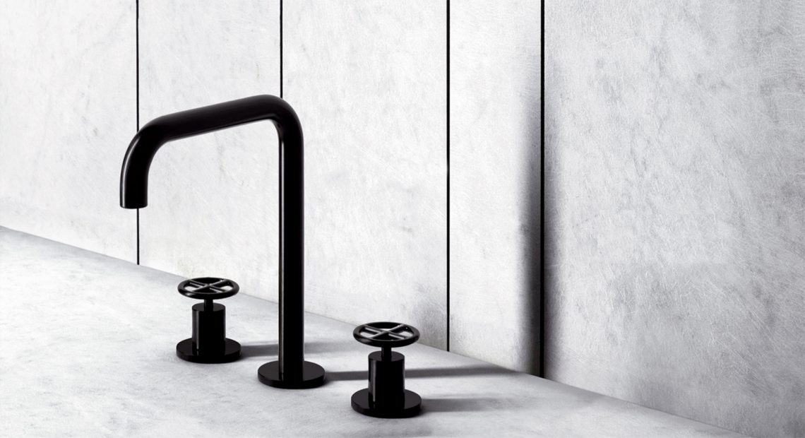
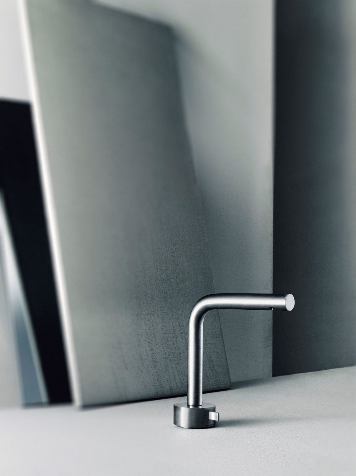
we now have four collections made entirely of stainless steel two of which are new in 2016. one designed by naoto fukasa is called aboutwater, a collaboration with boffi. aboutwater is the result of an exploration into the simplification of forms. the faucets and shower system become discs and cylinders; the taps look like the controls of a stereo. the design is so reduced the aesthetic quality of materials is emphasized.
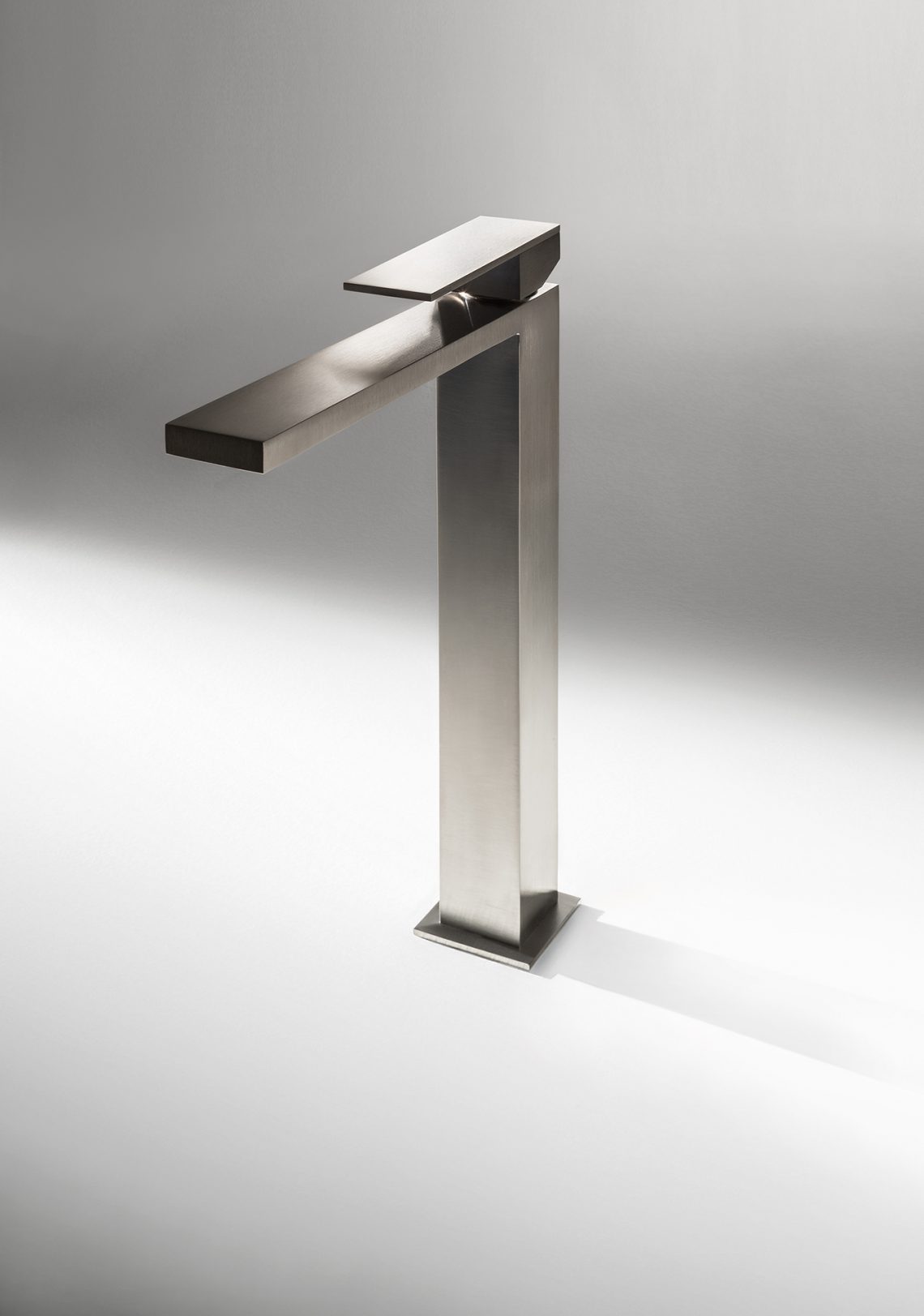
above> aboutwater af21 / below> mint
another new stainless steel product is mint and designed by angeletti (silvana) & ruzza (daniele). mint is a first in the marketplace, a square faucet. why is it the first? the reason everyone stays away from this shape is the difficulty to execute in production. with circular shapes you work with materials already available on the market. this shape is completely custom.
below> fantini in the luxehome design resource center in chicago’s merchandise mart
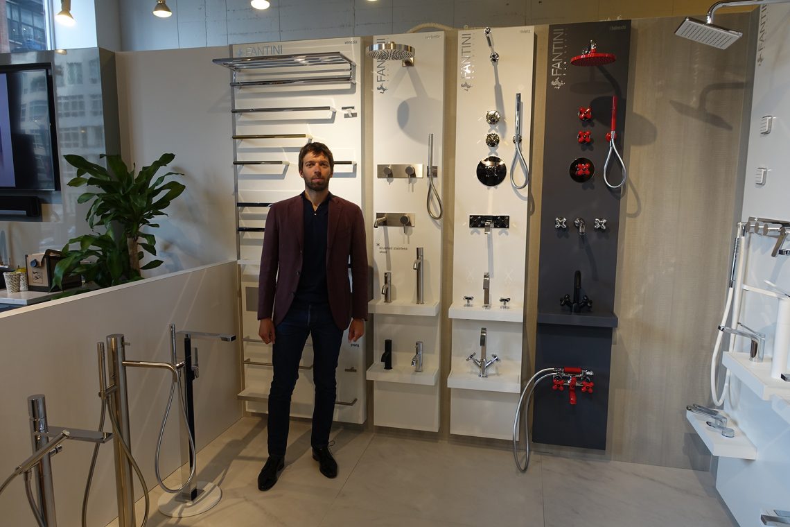
above> riccardo conti
[ fantini ]
